Quick Hunter: A Friendly Display Font for Digital Branding
As a UI designer who ships dozens of landing pages, SaaS dashboards, and e-commerce experiences each year, I pay close attention to how typefaces shape first impressions—and Quick Hunter consistently earns its place in my go-to display font kit. It’s not just charming—it’s purpose-built for digital warmth without sacrificing clarity or usability.
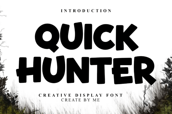
Quick Hunter is a rounded, casual display font with soft curves, open counters, and gentle stroke modulation. Its letterforms breathe—no tight corners, no aggressive contrast—just approachable rhythm. That makes it ideal for interfaces where you want users to feel welcomed, not instructed. Think of it as the typographic equivalent of a friendly smile during onboarding or a reassuring tone in a coaching app’s welcome screen.
Where Quick Hunter Shines in Web Layouts
In hero sections, Quick Hunter performs best at larger sizes (48px and up), especially against clean backgrounds or subtle image overlays. Its roundness enhances legibility on mobile viewports when used sparingly—say, for a single headline or tagline. I’ve used it effectively on boutique online store banners where personality matters more than austerity: “Handmade with Love” or “Your First Class Is On Us.” The font invites scanning, not scrutiny.
For call-to-action buttons, Quick Hunter works well at 18–22px on light or dark backgrounds, provided there’s sufficient padding and contrast (minimum 4.5:1 against background). Avoid using it for micro-interactions like tooltip labels or form field hints—its decorative nature reduces functional readability at small sizes. Reserve it for moments that need emotional resonance: launch announcements, limited-time offers, brand story headers, or course title cards.
It’s also a strong choice for portfolio site section headings—“Work,” “About Me,” “Let’s Connect”—where consistency meets character. Unlike script or handwritten fonts, Quick Hunter doesn’t sacrifice legibility for flair. And unlike ultra-thin modern sans serifs, it carries weight and friendliness without feeling dated.
Building Visual Hierarchy Without Sacrificing Tone
Quick Hunter naturally supports clear visual hierarchy when paired intentionally. Because it’s a display font—not meant for body copy—I always pair it with a neutral, highly readable sans serif like Inter, Manrope, or even system fonts (e.g., -apple-system, BlinkMacSystemFont) for paragraphs, navigation, and data tables. This pairing creates breathing room: Quick Hunter sets the mood; the sans serif delivers the message.
For editorial-style digital products—think newsletters, learning platforms, or blog headers—I sometimes layer it with a warm serif (like Cormorant Garamond or Literata) for subheads or pull quotes. That combo adds sophistication while keeping the voice human-centered. Just avoid stacking multiple decorative fonts: Quick Hunter’s personality is strongest when it’s the sole expressive element.
Readability & Responsiveness in Practice
On mobile, Quick Hunter remains legible down to ~36px in hero titles, but only if line height is generous (1.3–1.4) and tracking is slightly opened (+20–40 units). Tight spacing kills its airiness. For dark mode, ensure the font file includes hinted outlines—most modern webfont versions do—and test contrast rigorously. I’ve found #F8F9FA on #2D2D3A works well, but never rely on defaults alone.
When overlaying text on images, use a subtle semi-transparent background or subtle text shadow (1px black @ 30% opacity) to preserve readability. Quick Hunter’s rounded forms handle these treatments gracefully—unlike sharper display fonts that can look muddy or indistinct under effects.
Licensing, Formats, and Real-World Use
Quick Hunter is a premium font, available in standard webfont formats (WOFF2, WOFF), with full OpenType support. It includes uppercase, lowercase, numerals, punctuation, and basic multilingual characters (Latin-1, Latin Extended-A). While it doesn’t cover Cyrillic or Arabic scripts, its coverage suits most English-first digital products—including SaaS apps, Shopify themes, Notion templates, and Figma design systems.
Licensing is straightforward: a standard web license covers unlimited pageviews across one domain, making it suitable for client sites, online stores, and marketing microsites. If you’re bundling it into a commercial template (e.g., a WordPress theme or Figma UI kit), verify extended licensing terms—but for most independent designers and founders, the base license suffices.
When to Reach for Quick Hunter—And When Not To
Reach for Quick Hunter when your brand voice prioritizes warmth, creativity, and accessibility—especially in spaces where users are emotionally engaged: wellness apps, creative courses, indie product launches, children’s edtech, or local service websites (e.g., a yoga studio or ceramic studio). It strengthens brand identity by signaling intentionality: you didn’t pick a default font—you chose one that reflects your values.
Avoid it for financial dashboards, enterprise admin panels, legal disclaimers, or any interface demanding maximum neutrality or urgency. Its relaxed energy can dilute seriousness or speed perception. Likewise, skip it for long-form content, navigation menus, or tab labels—stick to robust, functional typefaces there.
In practice, I use Quick Hunter as a strategic accent—not an all-purpose tool. One client, a mindfulness coaching platform, applied it only to their homepage headline (“Breathe In. Begin Again.”) and CTA button (“Start Your Journey”). Everything else used Inter Light and Regular. Result? A 22% lift in scroll depth and stronger session duration—proof that thoughtful typography directly impacts engagement metrics.
Quick Hunter isn’t about decoration. It’s about alignment: between voice and visual, brand and interface, emotion and action. When deployed with intention—as a display font that serves the user, not just the aesthetic—it becomes part of the experience architecture. And in today’s crowded digital landscape, that kind of cohesion is rare, valuable, and quietly powerful.