Sorcha: A Display Font for Architectural Elegance Online
As a UI designer who ships dozens of landing pages and SaaS dashboards each year, I don’t reach for display fonts lightly. They’re not background players—they’re structural decisions. Sorcha is one of the few display fonts that earns its place in high-stakes digital spaces: hero sections, product launch banners, brand-led portfolio sites, and premium online stores. It’s not decorative fluff. It’s vertical precision made typographic.
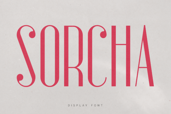
Sorcha stands apart with extreme verticality and slender proportions—think clean steel beams translated into letterforms. Its high contrast (sharp transitions between thick and thin strokes) delivers clarity at scale, while its restrained curves and open apertures support legibility even when set tightly or overlaid on textured backgrounds. This isn’t a font built for paragraphs. It’s engineered for impact: a single word, a short headline, a logo lockup, or a bold CTA button where tone and tension matter.
Where Sorcha Earns Its Place in Real Web Layouts
In practice, Sorcha thrives where hierarchy must be immediate and unmistakable. On a coaching website’s hero section, “Clarity Begins Here” in Sorcha—set large, centered, over a muted gradient—anchors attention before the user scrolls. In an online boutique’s banner, “Spring Edit” in Sorcha pairs with a lightweight sans serif body font to signal curated minimalism without sacrificing warmth. For a creative studio’s portfolio site, Sorcha used sparingly in project titles (“Structural Light”, “Monolith Series”) reinforces architectural confidence—no extra copy needed.
It performs exceptionally well in conversion-focused zones: CTA buttons benefit from Sorcha’s strong vertical rhythm, especially when paired with generous padding and subtle hover scaling. On dark-mode interfaces, Sorcha’s contrast shines—just avoid ultra-thin weights below 48px on mobile. For light backgrounds, use medium or bold weights with at least 32px size on desktop and 28px minimum on mobile viewports. Never stretch it; never condense it. Let its natural proportions breathe.
Readability & Responsiveness: Practical Guardrails
Sorcha is not meant for body text—and that’s by design. Its personality lives in brevity. Use it for headings, subheads, logos, and short accent phrases only. On mobile, reserve Sorcha for H1s above the fold and keep all other uses optional. Test rendering across iOS Safari and Chrome Android: Sorcha’s clean vector outlines hold up well, but always serve WOFF2 for optimal loading and fallback gracefully to a system sans (like -apple-system, BlinkMacSystemFont) in your font stack.
When layered over imagery—say, a lifestyle photo in a course sales page—add a subtle semi-transparent overlay or text shadow (1px black at 30% opacity) to ensure contrast meets WCAG AA standards. Avoid placing Sorcha directly over busy patterns or low-contrast gradients unless you’ve verified readability with real users.
Smart Pairings for Digital Brand Consistency
The power of Sorcha multiplies when paired intentionally. Its architectural rigidity balances beautifully with humanist sans serifs like Inter, Manrope, or IBM Plex Sans—fonts that offer warmth, neutrality, and excellent screen readability. For editorial or luxury-facing brands, try pairing Sorcha with a refined serif like Literata or Cormorant Garamond: the contrast between Sorcha’s sharp geometry and the serif’s organic flow creates visual sophistication without clutter.
Avoid pairing Sorcha with other high-contrast display fonts or scripts—it competes rather than complements. And skip monospaced or geometric sans serifs (like Space Grotesk or Neuzeit S) unless your brand deliberately leans into tech-forward austerity. Sorcha’s voice is calm authority—not cold utility.
Licensing, Formats, and Real-World Deployment
Sorcha ships as a premium font with full webfont support: WOFF2, WOFF, and variable font options (if available). Check whether it includes Latin Extended-A for multilingual sites—essential if you serve Spanish, French, or Polish audiences. Most licenses cover self-hosted web use, SaaS platforms, client websites, and digital templates—but verify usage rights for e-commerce storefronts (Shopify, BigCommerce) and embedded widgets. Some licenses restrict use in downloadable PDFs or editable Canva templates, so review terms before bundling into design systems.
If your workflow relies on Figma or Adobe XD, confirm Sorcha offers OpenType features like stylistic alternates or case-sensitive forms—these small details elevate branded assets like social media carousels or email headers. And always test loading performance: serve Sorcha with font-display: swap to prevent invisible text during load, and preload critical instances (e.g., hero H1) for perceived speed.
When Sorcha Strengthens, Not Distracts
I reach for Sorcha when the goal is tonal alignment—not novelty. A fintech dashboard using Sorcha for section headers signals precision and trust. A ceramicist’s online shop uses it for collection names (“Glaze Study”, “Vessel Line”) to mirror hand-thrown symmetry. A climate-tech startup deploys Sorcha in its investor pitch deck title slides—not to shout, but to settle: this is serious work, executed with care.
It doesn’t solve weak content or poor layout. But when your message is strong and your design is intentional, Sorcha elevates both—without asking the user to work harder. That’s rare in display typography. That’s why it stays in my active font library, not my archive.